R3 UX
Provided full-stack User Experience design for R3, a transaction servicing application in the operations space.
Provided full-stack User Experience design for R3, a transaction servicing application in the operations space.
R3 provides transaction servicing for checks, electronic, and cash transactions that have some issue. The system receives matters by a number of different sources, and then is either resolved automatically by the system or manually by an analyst or an operations rep in the R3 web application.
Users who used the system for various reasons have had an inferior user experience (SUS below average), many observed usability frictions and inefficiencies, and large data dumps on pages resulting in high cognitive load on certain views for several reasons:
Aware of some of the issues plaguing their application, R3 was looking for UX to “Harmonize” the application’s many different patterns and approaches.
To ensure R3 was able to achieve their goals of harmonization, several initiatives were undertaken and provided a prescription for success:
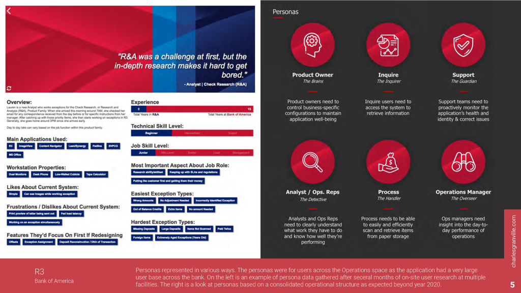
Groundwork research was conducted to gather data for personas of the various operations centers that use or would be using R3 in the near future. We documented pain points and represented as opportunities to enhance R3 with valuable features.
The groundwork research itself consisted of many on-site user interviews, environmental and ethnographic observations, and contextual inquiries. We conducted these research methods in multiple spaces, including ATM, check and electronic research (Atlanta and Dallas), financial center vaults, business safe operations sites (Jacksonville), and paper processing and storage (Atlanta and St. Louis).
The research was followed up with a workshop in Dallas with the goal of identifying matching patterns in process flows with entities that were already in the R3 system. We invited user’s and content experts from different sites to participate in helping achieve our goal and were able to create a User Flow Diagram, that matched user processes to similar stages. From there, we were able to conceptualize a new more straightforward approach to resolving transaction issues in the R3 application.
We created detailed personas from the groundwork research that identified the various roles and responsibilities in the spaces. Follow-ups research site visits were conducted to get additional data and further documents roles. Ultimately, we created a persona matrix that spaned hierarchy, skill-level, and space with the expectation that the persona fragmentation would combine as R3 simplified their process for resolving exceptions.

With the data gathered from the groundwork research and information collected from current initiatives, we came up with a roadmap to design particular value-adding features to propose adding to the R3 application.
Using the personas as a reference, we were able to separate the application into distinctive areas based on the user’s areas and responsibilities. We then were able to further determine the sub-areas of the architecture and even poly-hierarchical sections in the application.
The User-Centered Design process was followed for both overall application improvement and funded feature work.
The Research, Analysis, and Design stages were staggered ahead of sprint work to ensure enough of a roadway was available to design a particular feature properly.
During the design of a particular feature being added to R3 that provided that ability of different business areas to decide whether to Pay or Return transactions that arrive but there is not any money in their account, usability testing was conducted to gather strong data-driven evidence of the need for design changes in the application.
In total, 40 remotely moderated sessions were conducted with actual users from very distinctively different lines of business, with differing needs/use cases for using the feature. Each session measured goal completions and their subtasks for an overall effectiveness score. The session concluded with a SUS (System Usability Scale) post-test questionnaire.
Overall, the test results showed an increase in effectiveness and reduction of friction as the design was iterated on unless a significant change was introduced. The overall SUS increased from below average to above average.