- Website
- User Experience Design
- Angular Application
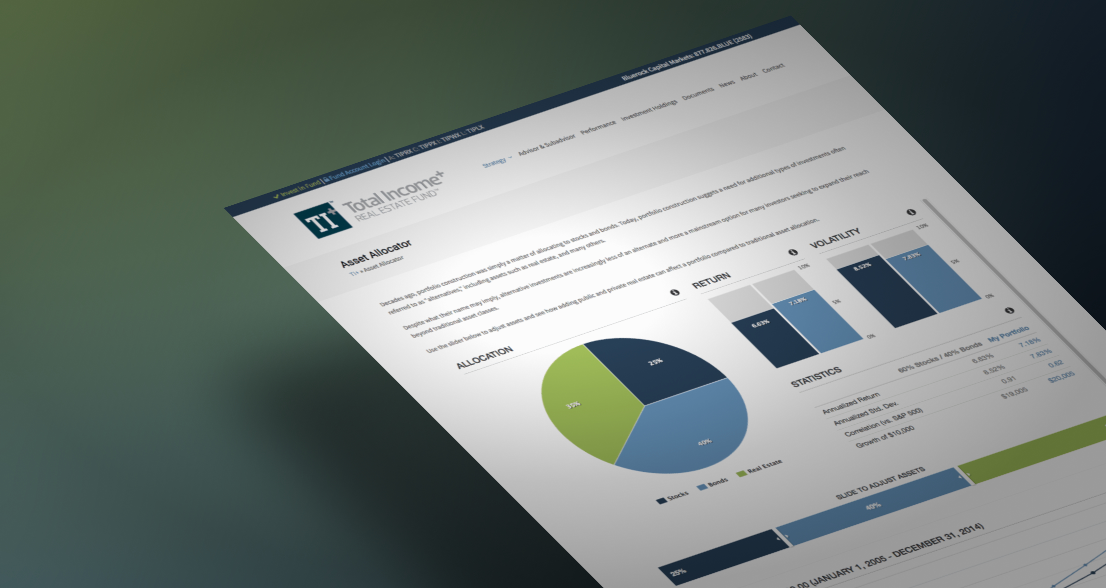
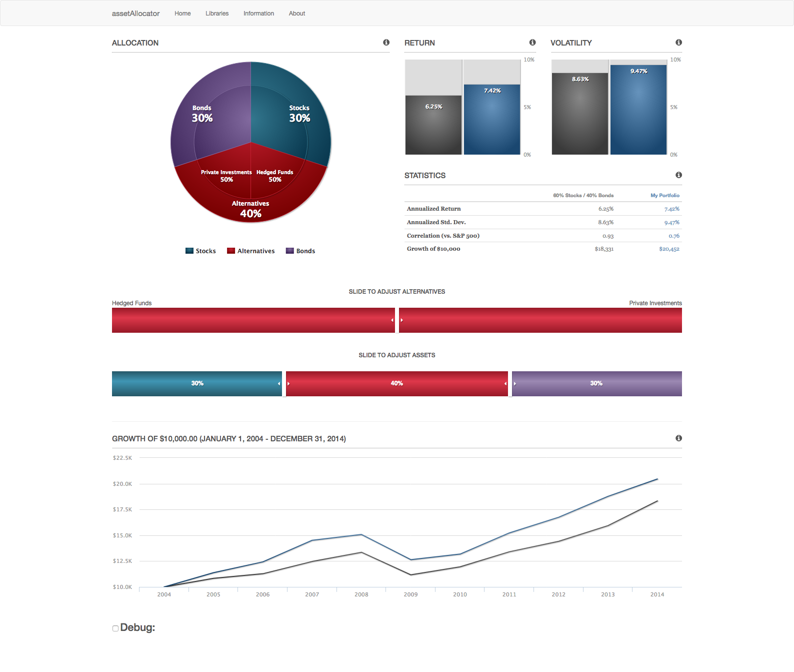
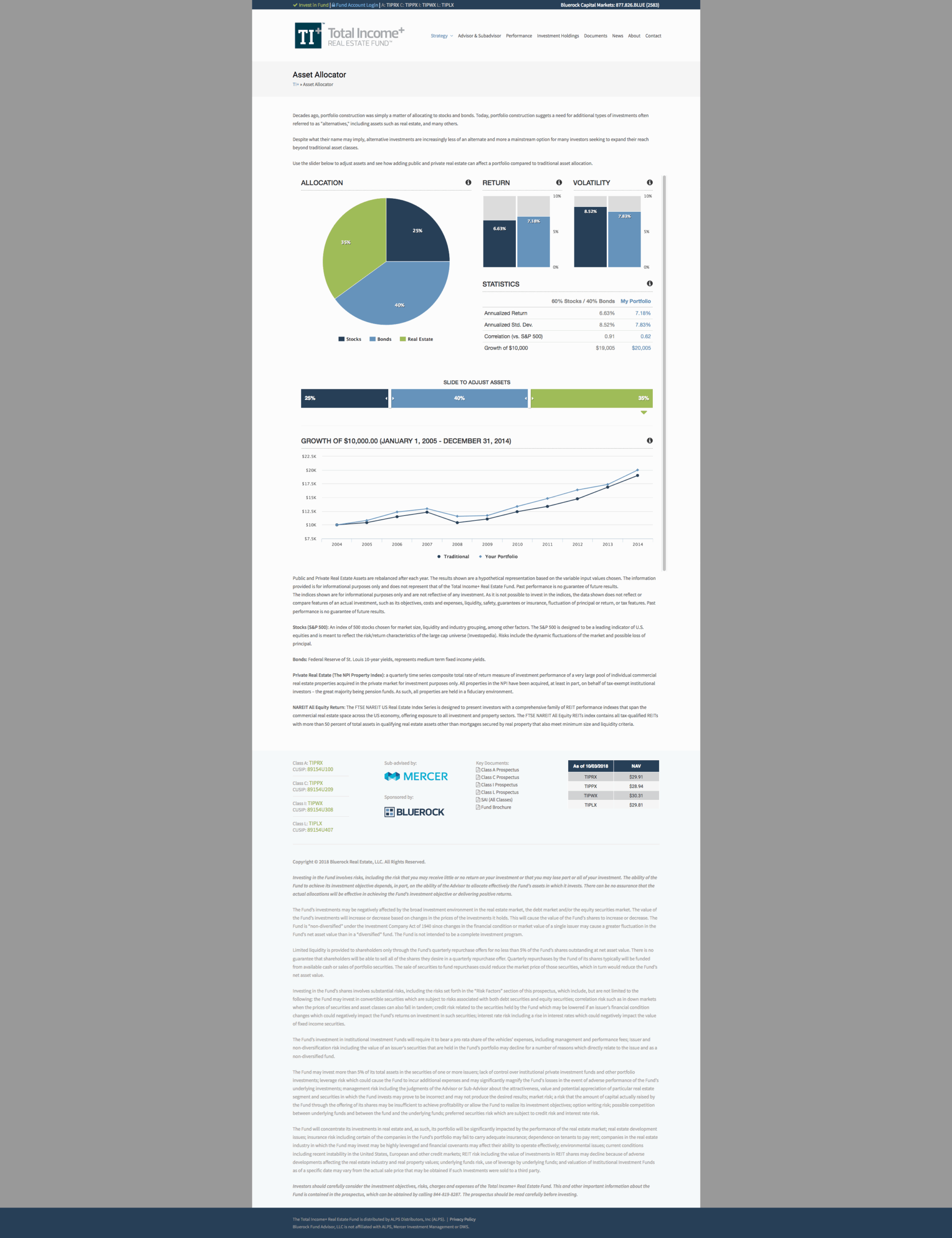
The Bluerock Asset Allocator is a modern, interactive asset allocation simulator originally redesigned in 2015 to bring a richer user experience to a legacy tool. This project involved rebuilding an older jQuery-based portfolio allocator from the ground up using AngularJS and Highcharts, enabling robust bi-directional data binding and responsive performance. The result was a coordinated multi-view interface where interactive charts and controls are linked in real-time – adjusting any input (such as an allocation slider) instantly updates all visualizations and figures. This seamless two-way binding creates a highly exploratory experience, allowing users to freely manipulate allocations and immediately see the impact across multiple views.
Product design and UX were at the forefront of this initiative. We employed coordinated multiple views (pie, bar, and line charts) to display different facets of an investment portfolio simultaneously, all synchronized for consistency. For example, users could tweak asset class weights via intuitive sliders, and the dynamic charts (a live-updating pie chart for allocation breakdown, bar charts for risk/return metrics, and line graphs for historical performance) would all update in concert. This real-time feedback loop, powered by Angular’s two-way data binding, encouraged users to simulate alternate asset allocation scenarios with confidence, exploring “what-if” outcomes backed by historical data. The design was focused on making complex financial data feel approachable – transforming heavy analytics into visually compelling and functional interfaces .
Visual styling was carefully reworked to align with Bluerock’s brand identity. The UI was given a clean, professional look consistent with Bluerock’s marketing, using the company’s color palette, typography, and imagery to ensure a cohesive brand experience. We actually produced two design versions to address different user needs: one variant was brand-aligned and streamlined – a simple, elegant interface appropriate for broad audiences – while an advanced version explored more sophisticated controls, including dual allocation sliders and layered pie charts to compare scenarios side-by-side. In the advanced concept, users could toggle between two allocation sets (e.g. current vs. proposed) with two sets of inputs, visualized as concentric pie charts for an at-a-glance comparison of portfolio compositions. This dual-slider approach provided a deeper analytical tool for power users, whereas the simpler version emphasized clarity and ease of use, with minimal complexity. Both designs prioritized clarity, responsiveness, and an immersive, exploratory UX that invites users to play with data.