- Banking and Finance
- Web App
Bank of America’s CashPro platform processes millions of corporate transactions every day. Each payment data point carries a stack of base‑level signals that help to identify what dimension these data points are describing and communicating.
A data point, such as a payment, is comprised of a pattern of signals, and when aggregated, exposes cost leaks, timing inefficiencies, and fraud risk. CashPro Insights was conceived to analyse both layers: signals attached to raw data and the emergent patterns those signals create in aggregate.
Our design goal was clear: transform these patterns into plain‑language recommendations that a CFO or Treasurer can absorb at a glance, yet still allow them to trace each recommendation back through insights, to the underlying signals, and down to the raw transactions if they desire full validation.
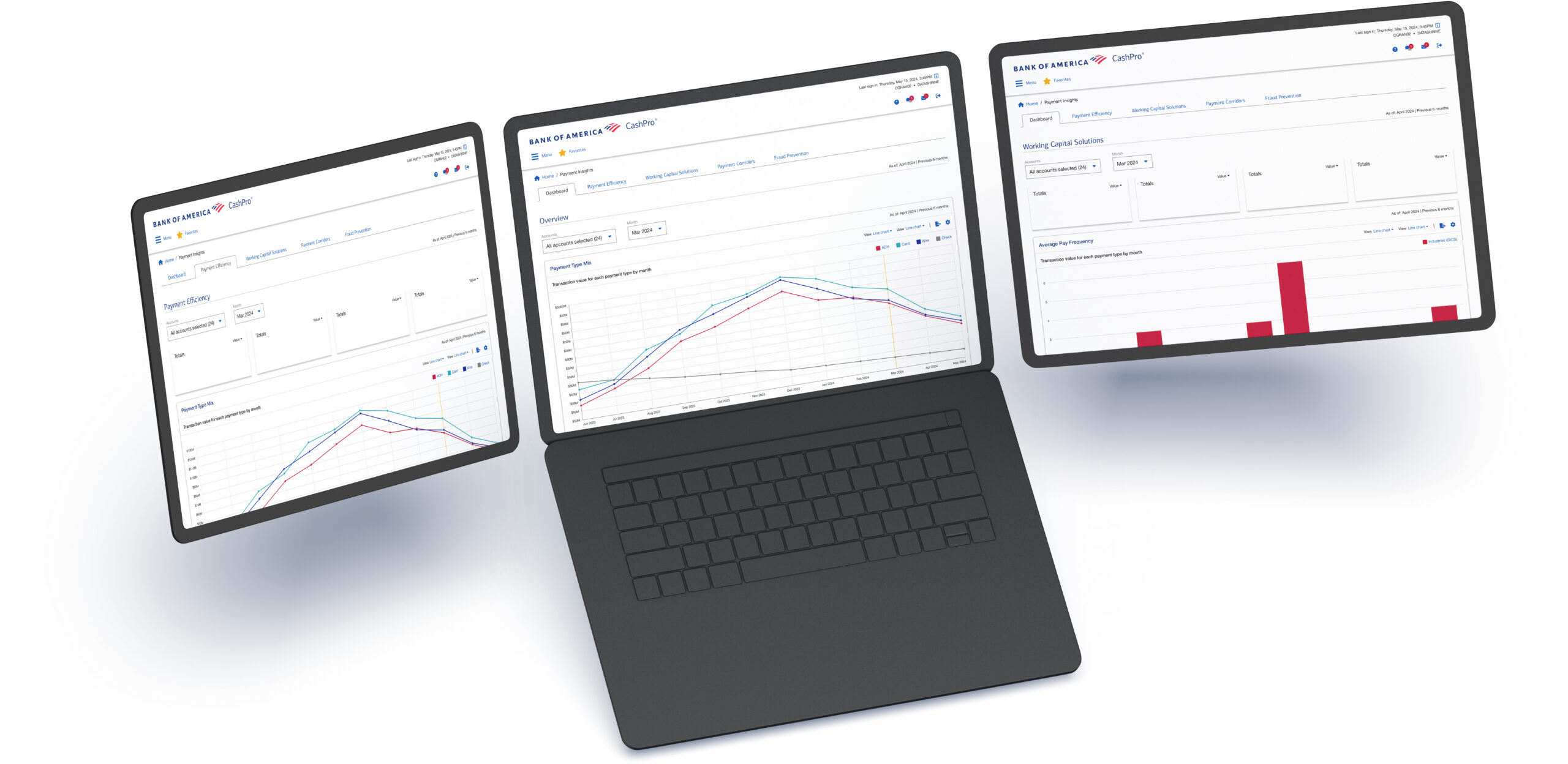
The result is a Financial Intelligence Dashboard that turns mountains of payment data into an embedded advisor, guiding corporate finance teams to optimize their payment mix, improve working capital, streamline cross‑border flows, and reduce fraud exposure—all within their existing CashPro workflow.
Additionally, a framework for scaling recommendations from the initial few to what could perhaps be thousands of ways a client could make tactical and strategic decisions that would result in operational efficiencies and cost savings.
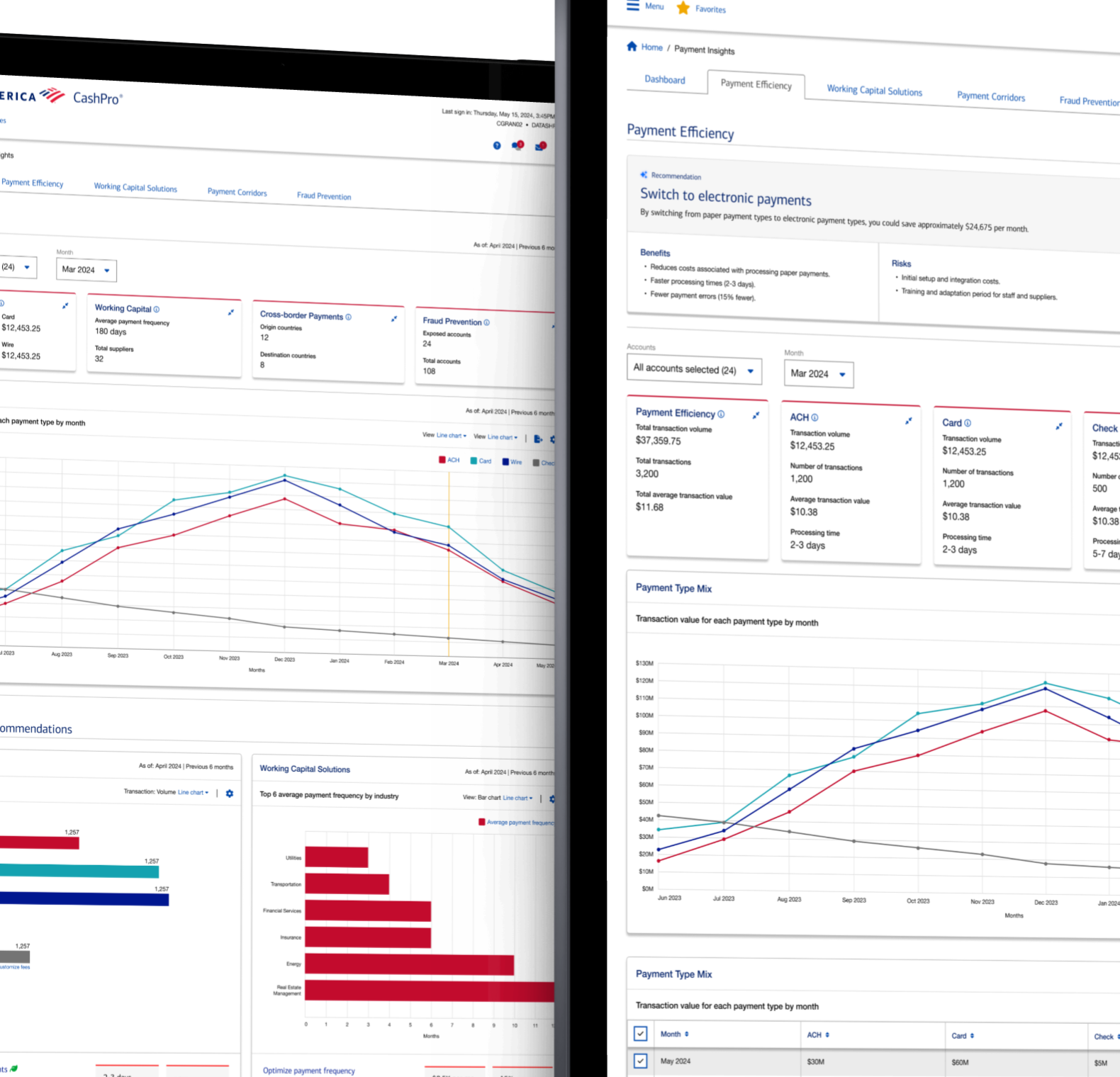
CashPro Insights (now known as CashPro Data Intelligence) is an advanced decision-support capability within Bank of America’s CashPro platform, designed to help global businesses optimize their treasury operations through AI-driven insights and high-fidelity data visualizations.
- Data‑Driven Design: The design focused heavily on payments and accounts data, which was analysed using ML/AI to generate insights and recommendations.
- Signals: Broke down insights and identified design signals and cues that could be mapped to tokens and common design patterns or prompt the exploration of new patterns for visualizing data.
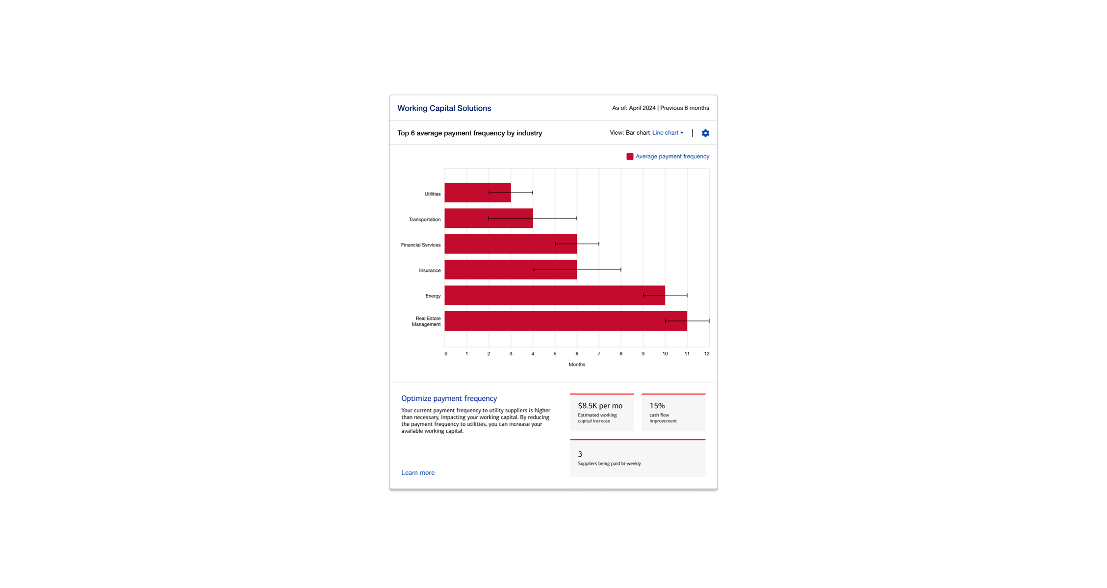
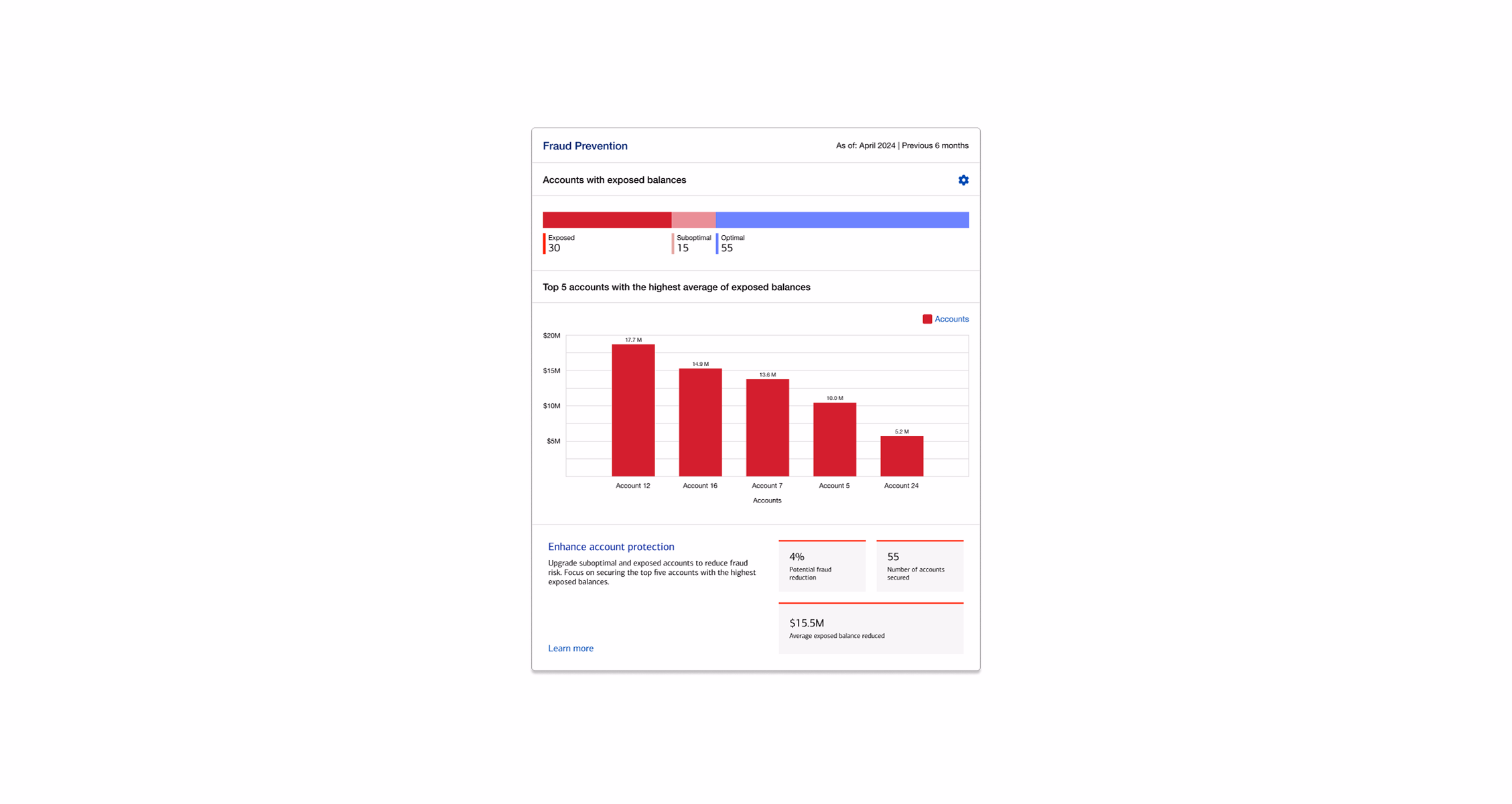
- Actionable Intelligence: Insights delivered in four domains – Payment Efficiency, Cross‑Border Payments, Working Capital, and Fraud Prevention – directly within CashPro, saving money and reducing risk.
- User‑Centered Approach: Conducted research, gathered feedback, and validated designs with users to ensure the product met with user’s expectations and needs, resulting in an product experience that balanced high‑level clarity with auditability, had trustworthy data presentation, reduced manual efforts for their teams in analyzing and generating common insights, significantly reducing manual analysis, and enabling accelerated decision making and guidance on optimizing their treasury operations.
- Enterprise Impact: Demonstrates how UX + AI analytics can elevate a banking platform from a transaction tool to an intelligence dashboard influencing strategic treasury decisions.
Bank of America’s CashPro platform processes millions of corporate transactions every day. Buried in that activity are patterns—signals—that reveal cost leaks, timing issues, and fraud risk.
Bank of America recognized that while pockets of analytics (e.g. Excel macros, Tableau dashboards) existed, there was no central interface that aggregated data or provided strategic next steps. Teams were spending significant time deriving insights manually, particularly across domains like payments, working capital, FX, credit, and security. Moreover, there was an opportunity to leverage ML to surface patterns in transactional, temporal, and contextual signals. A clean, clear user interface was critical to translating these signals into strategic, user-friendly recommendations.
Clients needed a smarter, transparent, and actionable way to sift through transactional noise and drive decisions.
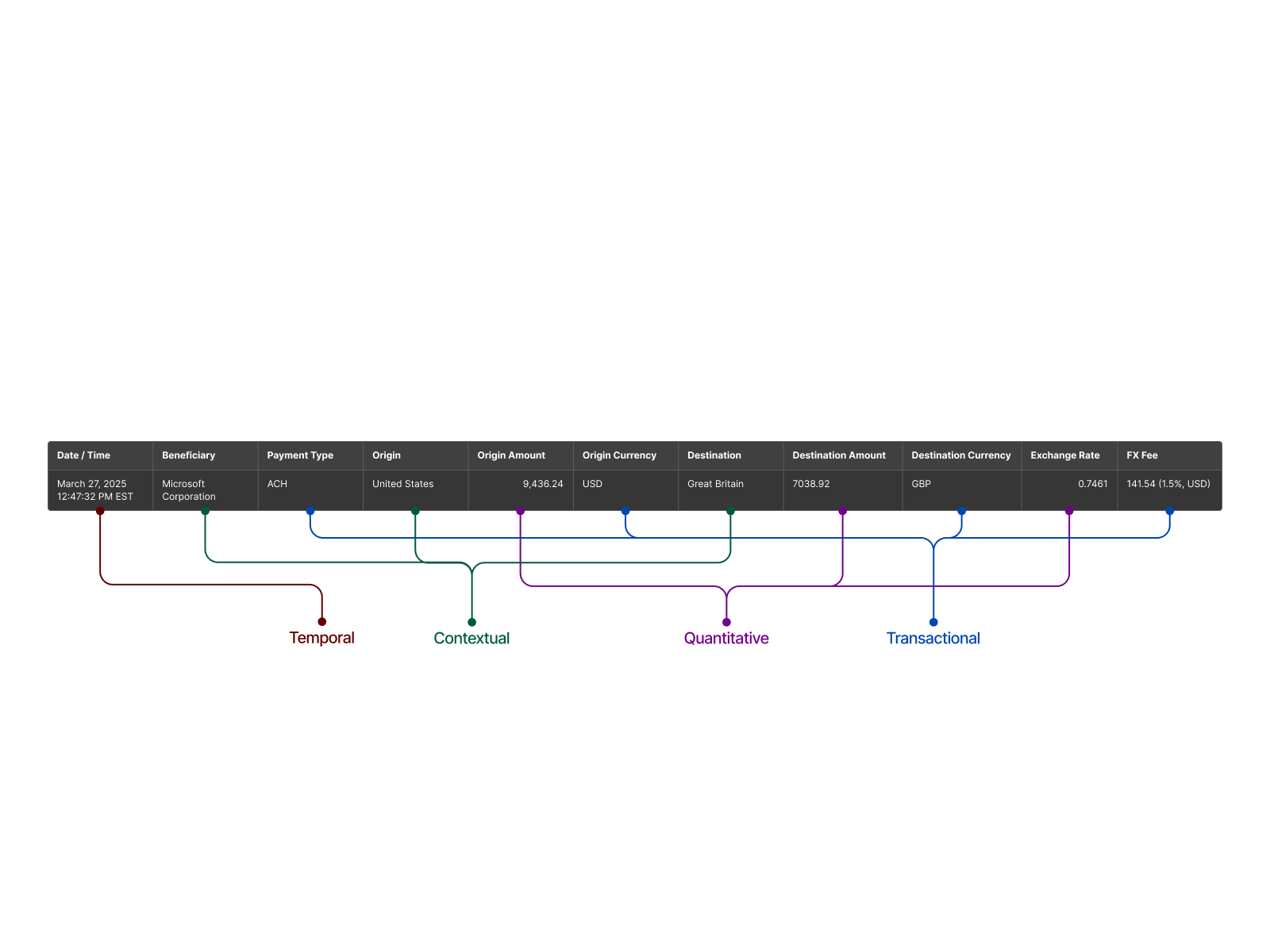
In data science, what are often referred to as “dimensions” or “attributes” can be understood here as signals. Signals describe the specific qualities or dimensions a data point conveys. These qualities can be leveraged to explore anomalies or identify patterns across data sets. In our design context, we treat signals not just as descriptors but as the basis for design decisions—translating them into effective visualization patterns that help communicate the underlying record or transaction with clarity.
Signals as descriptors of a single data point
Every payment embodies at least five descriptive layers: it is transactional (an exchange of value), temporal(happens at a precise moment), contextual (ACH vs. wire, domestic vs. cross‑border, etc.), inferred (risk score or forecast added by modelling), and behavioral (the pattern of how often that payment type occurs). Labelling those layers up front tells us which story the data point can tell and informs the visual grammar—bar, line, heat‑map, gauge—that will communicate it best.Signals as patterns across many data points
A single payment’s signals matter, but clusters of similar signals expose cost leaks, timing issues, or fraud. We therefore differentiate base‑level signals (attached to raw records) from pattern‑level signals (aggregations and correlations). This distinction underpins our four‑layer hierarchy—Recommendation → Insight (pattern) → Signal (data point) → Raw data—so users can trace every conclusion back to first principles.
In data science, signals refer to meaningful information extracted from raw data. In the context of UX, we use these extracted signals to extrapolate meaning, inform user understanding, and guide design decisions. Thus, for our purposes, signals are both data descriptors and tools that enable effective communication through design.
Why Signals Matter in Product Design
Signals steer us toward well‑known visualization patterns—bars for magnitude, lines for trends—and inspire new visual forms when conventional charts fall short. Having a shared signal vocabulary lets designers and data scientists jointly decide when to reuse a tried‑and‑true chart and when to invent a bespoke graphic that better reveals a relationship.
From Signal to Visualization
| Signal Type | Example in CashPro | Typical / Novel Visual |
|---|---|---|
| Transactional | Fee per wire transfer | Baseline bars or lollipop chart |
| Temporal | 6‑month ACH‑volume trend | Area chart with moving‑average overlay |
| Contextual | ACH cost vs. industry avg | Bullet chart or slope graph |
| Behavioral | User approval timing patterns | Heat‑map calendar |
| Inferred | Predicted fraud probability | Gauge, radial band, or risk badge |
Practical Outcome
When stakeholders asked “How should we show FX corridor efficiency?” we replied “Which signals tell that story?” By mapping signals first, the team chose visuals with intentionality. Every pixel now earns its place—simplifying complexity while preserving traceability.
Lorem ipsum dolor sit amet, consectetur adipiscing elit. Ut elit tellus, luctus nec ullamcorper mattis, pulvinar dapibus leo.
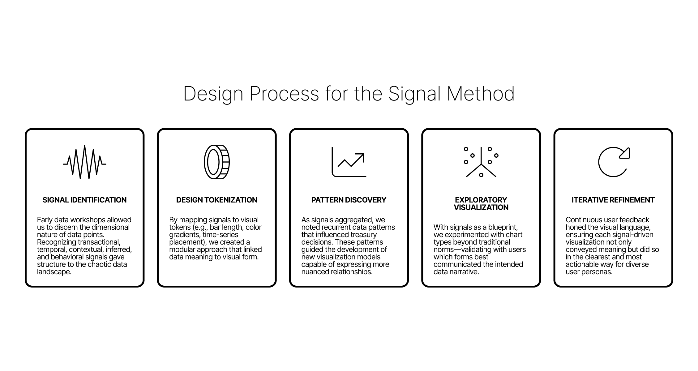
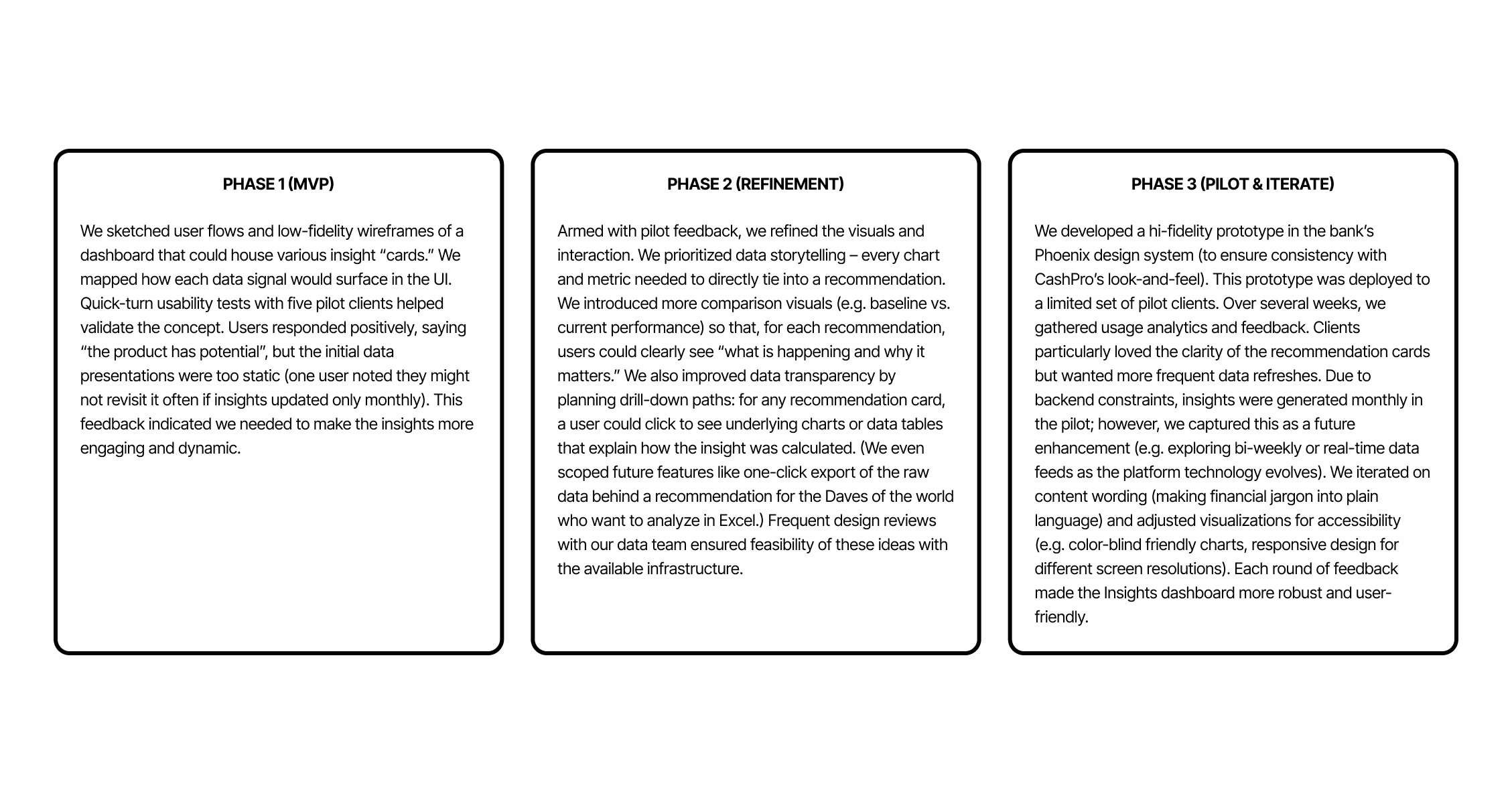
Throughout the lifecycle of CashPro Insights, the design process evolved in tandem with the discovery and refinement of design signals. Initially, our focus was on understanding raw payment data and its associated attributes, but as the project progressed, we reached pivotal moments where we could begin to deconstruct and categorize data into actionable signals. These signals served as the foundation for both refining existing visualizations and exploring novel data storytelling methods.
At each stage, signals acted as a cue to rethink both content and form—empowering users to engage with data intuitively and make reliable, context-aware decisions for treasury optimization.
To validate the signals chosen during our iterative design process, we conducted in-depth user walkthroughs, testing not only the visuals but the interpretability and contextual relevance of each design signal. During these sessions, we engaged users with targeted, open-ended questions to probe their understanding:
- What’s happening here?
- What do you think this is for?
- What can you do with this?
- Would this help you in your day-to-day decision-making?
This approach helped us quickly identify designs where the signals didn’t land or didn’t support user goals effectively. We adjusted accordingly—sometimes in micro-iterations—to ensure that users could extract value effortlessly.
Lorem ipsum dolor sit amet, consectetur adipiscing elit. Ut elit tellus, luctus nec ullamcorper mattis, pulvinar dapibus leo.
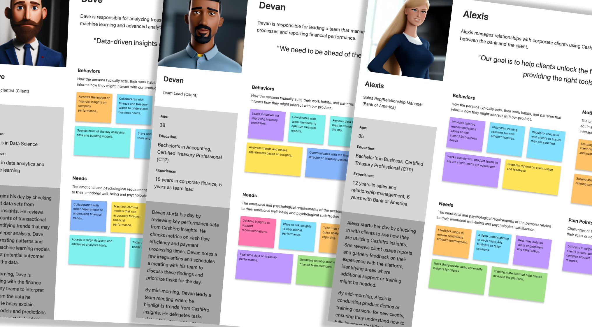
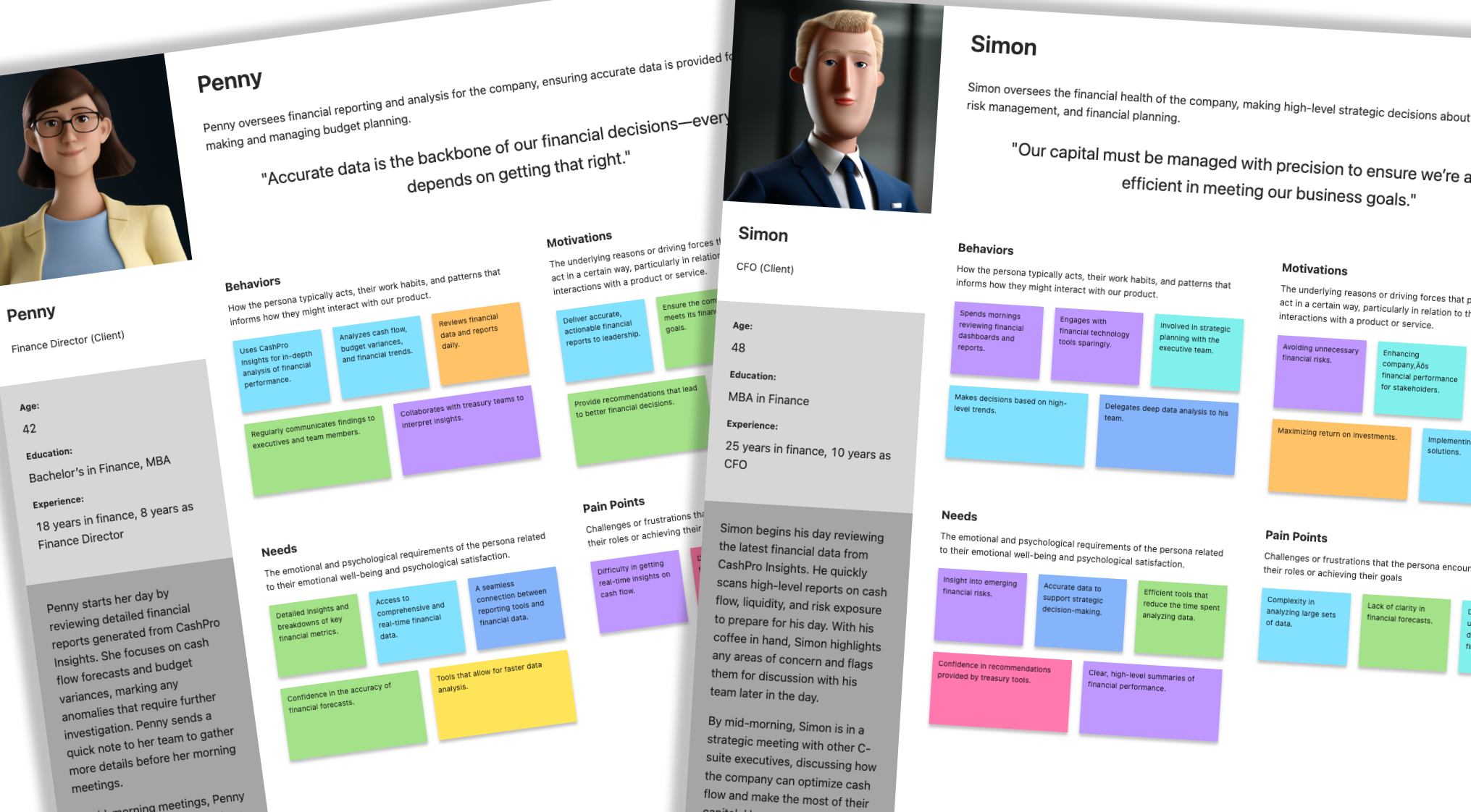
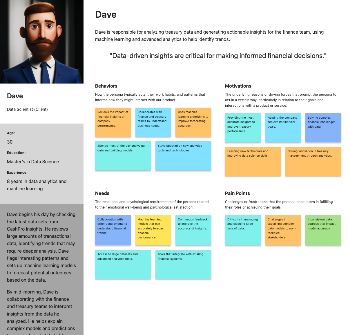
As a result of a series of user interviews, we also refined personas to understand how different roles responded to these design signals:
- Alexis – Sales Representative: Prioritized simplicity and clarity, relying on signals that supported immediate status checks.
- Devan – Treasury Ops Lead: Needed signal-rich detail, especially in efficiency and fraud contexts, to trigger deeper dives.
- Penny – Finance Director: Required strategic overviews backed by credible, high-level signals to inform broader cash flow decisions.
- Dave – Data Scientist: Demanded traceable, technically robust signals for validation and deeper exploratory analysis.
These insights about design signal perception informed how we crafted and refined visual hierarchies throughout the product.Success in Simplification
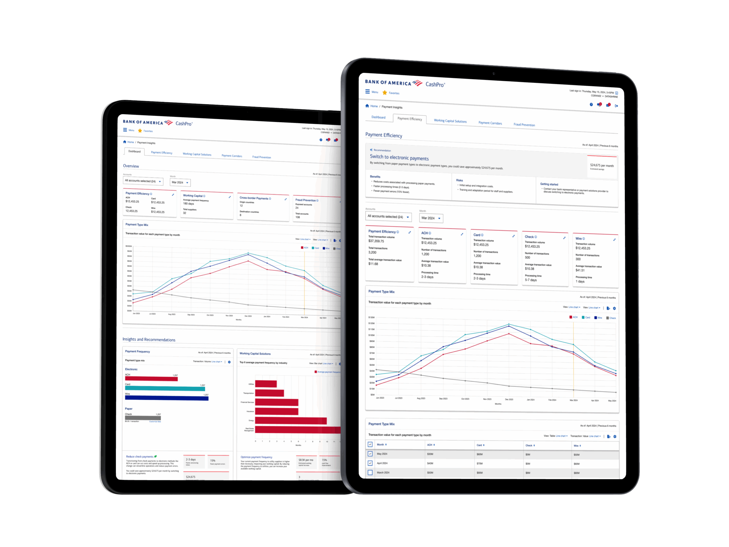
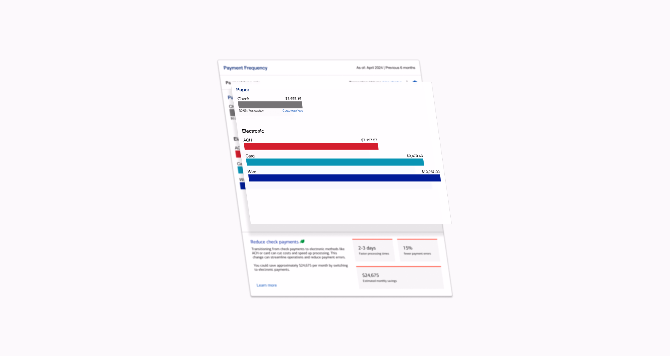
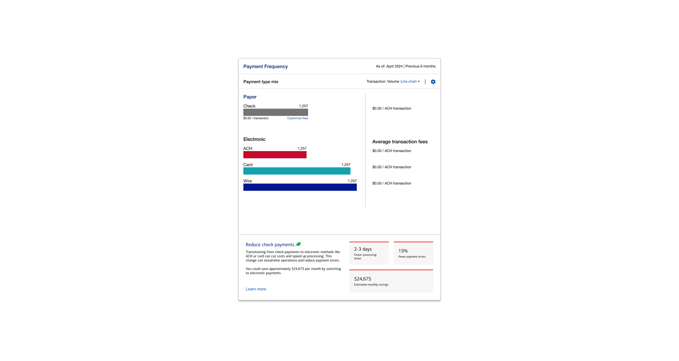
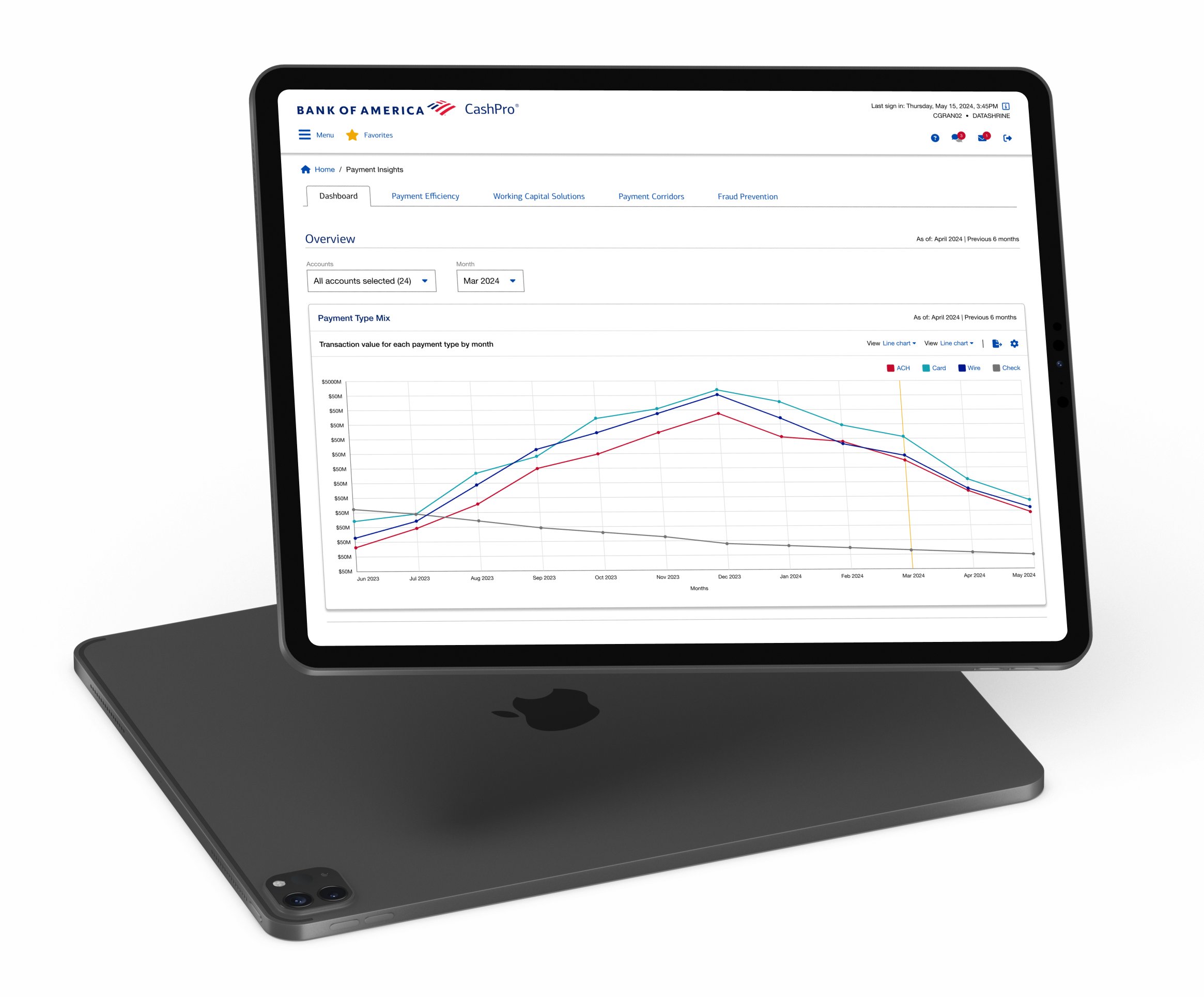
One key success was in Payment Efficiency. Initially, we visualized payment type mix as a full horizontal bar chart, grouped by paper (e.g., checks) and electronic payment types (e.g., credit, wire, ACH). Through validation, we discovered that only spatial comparison between bar lengths, essential labels, and amounts/fees were necessary. Superfluous elements—axis lines, series labels—were stripped back. This yielded a cleaner, more intuitive visualization, aligned precisely with user needs and the design signals driving their decisions.
Lorem ipsum dolor sit amet, consectetur adipiscing elit. Ut elit tellus, luctus nec ullamcorper mattis, pulvinar dapibus leo.
We used the Design Signal Method to determine how to communicate and visualize data points and refine insight visualizations. This framework helped guide the visual and interactive representation of each insight, ensuring that users could understand the data clearly and act on it effectively.
This design signal methodology allowed us to create visual consistency across the platform while enabling flexibility to adapt and innovate based on user needs and data complexity. The result was a highly contextual and user-aligned visualization strategy, directly supporting the goals of treasury optimization.
Lorem ipsum dolor sit amet, consectetur adipiscing elit. Ut elit tellus, luctus nec ullamcorper mattis, pulvinar dapibus leo.
Throughout the process, close collaboration between design, product, and engineering was crucial. We frequently sat with data scientists to translate complex analytics into digestible UI components. By the end, we had a validated design that was not only usable and useful, but also credible – a critical factor for adoption in the finance domain.
Lorem ipsum dolor sit amet, consectetur adipiscing elit. Ut elit tellus, luctus nec ullamcorper mattis, pulvinar dapibus leo. Lorem ipsum dolor sit amet, consectetur adipiscing elit. Ut elit tellus, luctus nec ullamcorper mattis, pulvinar dapibus leo. Lorem ipsum dolor sit amet, consectetur adipiscing elit. Ut elit tellus, luctus nec ullamcorper mattis, pulvinar dapibus leo. Lorem ipsum dolor sit amet, consectetur adipiscing elit. Ut elit tellus, luctus nec ullamcorper mattis, pulvinar dapibus leo.
The presentation of insights – calculated measures derived from raw data and signals, as well as suggestions/recommendations on what actions the treasury teams can take, is an accelerator for subscribed CashPro clients to optimize their treasury operations across the provided focus areas.
Bank of America’s CashPro platform processes millions of corporate transactions every day. Each payment data point carries a stack of base‑level signals that help to identify what dimension these data points are describing and communicating.
A data point, such as a payment, is comprised of a pattern of signals, and when aggregated, exposes cost leaks, timing inefficiencies, and fraud risk. CashPro Insights was conceived to analyse both layers: signals attached to raw data and the emergent patterns those signals create in aggregate.
Our design goal was clear: transform these patterns into plain‑language recommendations that a CFO or Treasurer can absorb at a glance, yet still allow them to trace each recommendation back through insights, to the underlying signals, and down to the raw transactions if they desire full validation.
The result is a Financial Intelligence Dashboard that turns mountains of payment data into an embedded advisor, guiding corporate finance teams to optimize their payment mix, improve working capital, streamline cross‑border flows, and reduce fraud exposure—all within their existing CashPro workflow.
Additionally, a framework for scaling recommendations from the initial few to what could perhaps be thousands of ways a client could make tactical and strategic decisions that would result in operational efficiencies and cost savings.
Lorem ipsum dolor sit amet, consectetur adipiscing elit. Ut elit tellus, luctus nec ullamcorper mattis, pulvinar dapibus leo. Lorem ipsum dolor sit amet, consectetur adipiscing elit. Ut elit tellus, luctus nec ullamcorper mattis, pulvinar dapibus leo. Lorem ipsum dolor sit amet, consectetur adipiscing elit. Ut elit tellus, luctus nec ullamcorper mattis, pulvinar dapibus leo. Lorem ipsum dolor sit amet, consectetur adipiscing elit. Ut elit tellus, luctus nec ullamcorper mattis, pulvinar dapibus leo.
Designing CashPro Insights was a masterclass in blending data science and UX design. One major takeaway was the importance of trust and transparency when introducing AI-driven insights in a conservative domain like corporate banking. We learned to never present a “black box” recommendation – users like Dave, the data analyst, quickly challenged any insight that wasn’t clearly backed by data. By implementing layered drill-downs and explaining the “why” behind each suggestion, we gained user trust. As a result, even skeptical users began to rely on the dashboard, knowing they could always peek under the hood if needed.
Another takeaway was the value of focusing on the user’s context and workflow. Initially, we weren’t sure if busy finance folks would log into a separate dashboard regularly. By integrating insights into the existing CashPro portal (and planning for features like email alerts or in-app notifications for new recommendations), we fit into the users’ natural routine. This taught us that the best insights are useless if they don’t reach users at the right time and place. Our design had to meet users where they already are – in this case, right when they log in to manage their daily cash operations.
Collaboration was also key. We navigated challenges around data availability and accuracy by maintaining a tight feedback loop with engineering. When the data scientists informed us that some data would only update monthly, we adjusted our designs to set the right expectation (e.g. labeling insights as “This month’s analysis” and avoiding real-time language). This project reinforced that designing with real data early prevents creating pie-in-the-sky solutions that can’t be implemented. By prototyping with actual (anonymized) client data from the start, we uncovered technical constraints early and designed around them.